
Building Responsive Websites: Why Mobile-First Design is Essential
Take a look around; everyone’s on their phones. In fact, over 60% of web traffic worldwide now comes from mobile devices. If your website isn’t optimized for mobile, you’re already losing potential customers. This is where responsive design and the mobile-first approach come in.
At ESM Global Consulting, we build websites that adapt seamlessly to any screen size, ensuring your business never misses an opportunity to connect with its audience. Let’s explore why mobile-first design is essential in today’s digital world.
What is Responsive Design?
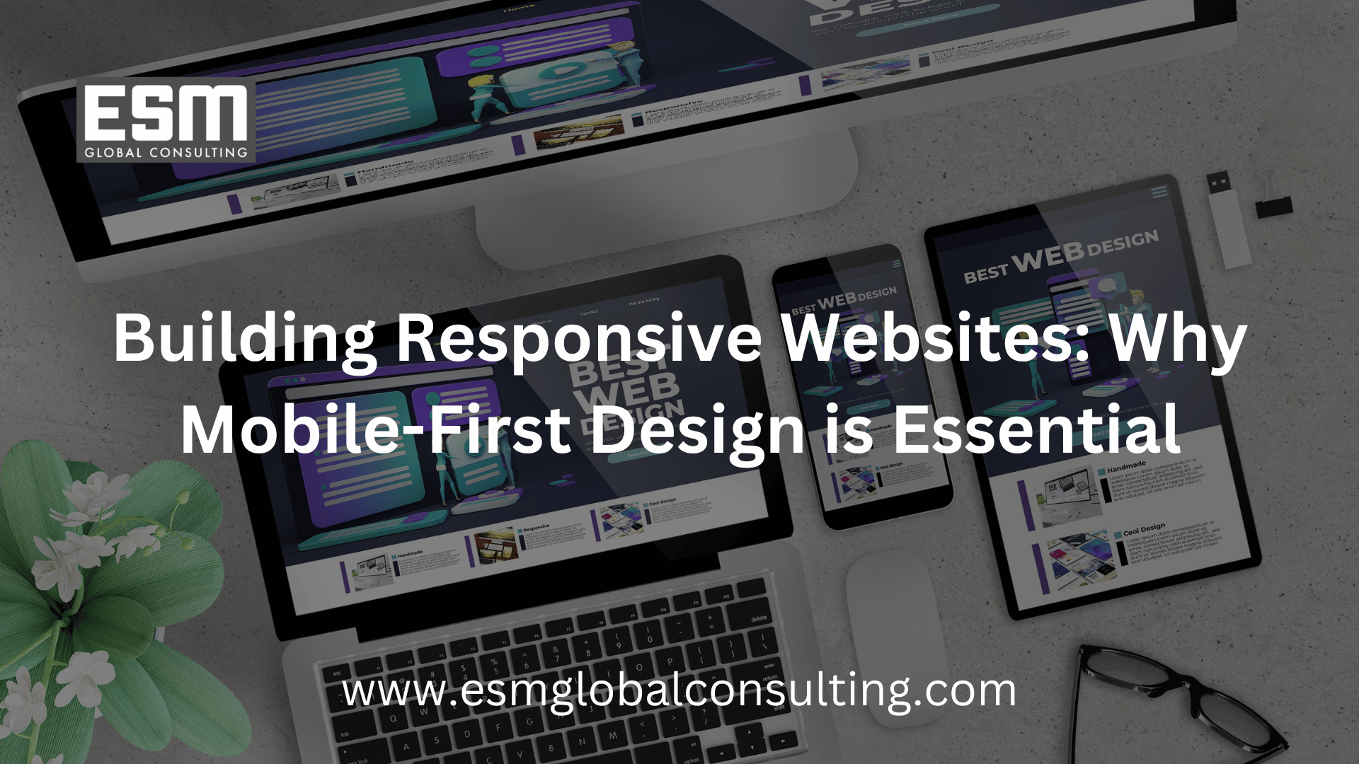
Responsive design ensures that your website automatically adjusts its layout, images, and functionality based on the device being used whether it’s a phone, tablet, or desktop.
Key elements include:
Flexible grids and layouts
Scalable images and videos
Mobile-friendly navigation and buttons
What is Mobile-First Design?
Mobile-first design flips the traditional approach. Instead of starting with desktop layouts and scaling down, developers start by designing for mobile screens first, then expand to tablets and desktops.
Why? Because mobile is no longer secondary, it’s the primary way users experience the web.
Why Mobile-First Matters
User Experience: Mobile-first sites load faster, look better, and are easier to navigate on small screens.
SEO Benefits: Google prioritizes mobile-friendly websites in search rankings.
Higher Conversions: A seamless mobile experience means fewer drop-offs and more sales or sign-ups.
Future-Proofing: As mobile usage continues to grow, businesses that adopt mobile-first now will stay ahead.
Best Practices for Mobile-First Design
Prioritize speed with lightweight images and optimized code
Use touch-friendly elements (buttons, menus, forms)
Focus on clear, concise content for smaller screens
Implement progressive enhancement—start simple for mobile, then add complexity for larger devices
Real-World Examples
E-commerce stores see higher sales when checkout is optimized for mobile
News websites retain readers with fast, scroll-friendly layouts
Corporate websites earn trust with professional, consistent experiences across all devices
Conclusion
Mobile-first isn’t just a design trend, it’s a business necessity. By putting mobile users first, you’re not only improving user experience but also boosting your SEO, conversions, and long-term growth.
At ESM Global Consulting, we specialize in building responsive, mobile-first websites that perform across all devices.
Ready to future-proof your website? Let’s design it with mobile at the core.